Balance
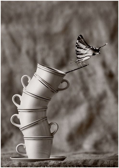
To achieve balance, the elements in a space need to be distributed equally so that the weight in size, shape, color, and text is visually appealing and harmonious.
One way to do this is through symmetry. This photograph of the Brooklyn Bridge is an example of symmetrical balance because both sides of the image mirror each other horizontally. It gives the bridge a very formal, stable, and static look.
Asymmetry can also create balance and is usually easier on the eyes, as is the case in the image below. There is an inherent movement and informality in asymmetry, which is referred to as “dynamic tension”.

Contrast
These two spray paint cans look identical in size, shape, and alignment, but they contrast in that the black and white are inverted in relation to each other. The contrast in color is highlighted, and it draws our attention to their differences. This principle can be used to change perceptions and messages.
Emphasis
The first noticeable element on a page is created by emphasis. The design below shows a cat with human eyes. The human eyes break up the image of the cat through the use of color, shape, and perception. It causes the eyes to become the focal point in this piece.
Movement
The focal point in this image is the teacup because there is movement through the curve of the arm and wrist, as well as the pouring of tea, which leads us to the cup. The visual movement, also known as flow, in this image directs our eyes where they need to go.
Rhythm
Together, repetition and movement create a visual rhythm. In Warhol’s painting, the repetition of size, shape, and composition creates a clear pattern in the cans. Also, the use of various contrasting colors causes movement and makes our eyes bounce around the canvas. These techniques are what create the visual rhythm in this case.
Unity
The combination of elements in this image comes together to form a face. Contrast is used between warm and cold colors to convey a feeling, and the repeating pattern of floppy disks makes a visual rhythm. There is also emphasis by way of colors drawing our focus to different parts of the face. The harmony between these design principles is what makes the whole image work as one.


